Australian Mobile Food Vendors Group
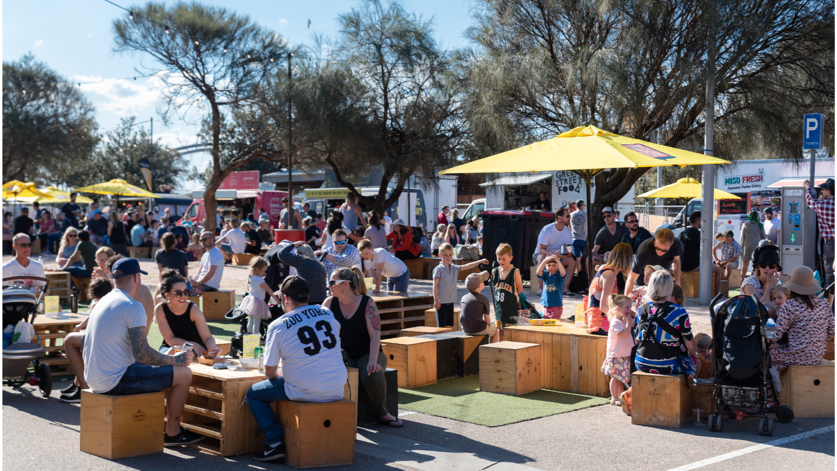
Australian Mobile Food Vendors Group (AMFVG) is a national company providing a variety of products and services to the mobile catering industry. We support food trucks, vans, trailers and marquees with the view to develop and grow the mobile catering industry in Australia.
Services
Our members benefit from:
Participating at events
Advertising and promotion
Acquiring discounted products
Priority access to event expression of interest and tenders
Australian event and festival guide
Receiving professional support and advice
AMFVG owns and manages Where The Truck, which is an initiative to help grow and shape the mobile food industry in Australia
Our Expertise
Based in Melbourne, AMFVG stands as a premier name in bespoke catering services, collaborating with Australia’s top chefs, restaurateurs, and food truck operators. Specialising in events, product creation and technology services, we cater to the diverse needs of event catering.
We operate a national network of premium vendors, curating exceptional culinary experiences tailored to each event. Our proven track record in large-scale event management, vendor coordination, and customer engagement has positioned us as a trusted partner in delivering high impact, food-focused activations.
We partner with a network of celebrity chefs, credible brands, innovative food truck operators delivering everyone’s favourites and the latest trending must haves.